Notes taken on 23 June 2024.
(This book is in the public domain in most countries, so I am permitted to reproduce images.)
Start your journey in sketching with humble expectations - you will be disappointed and may be discouraged by how gradual the development of this skill is. Delight in the faintest indications of improvement and remember that years of study have been undertaken by everyone whose ability you envy. Frequent failure is inseparable from the first efforts in this or any other art; but these very failures, when overruled by patience become the means by which the goal of success is ultimately reached.
In the age of photography, it is important to remember that art is not about the perfect replication of something. We are seeking a more poetic form of expression. You are not finished when you have completed the laborious effort of copying, but when you have extracted the picturesque portion from the landscape before you.
That is not to say that you should disregard the importance of grounding your work in reality. Facts form the basis of art, and are required for the production of great work.
We can start by holding the view that the less we draw of something the more effective the sketch will be. Single objects composed of a few well defined lines, such as stiles, rustic bridges, cottages, and so on, afford the best examples for those who have just begun to sketch from nature. Avoid a general scene as a beginner.
Once we have found a subject, start by drawing the general direction of the lines in a light, free style, with touches producing a full effect on the paper, and yet capable of easy erasure.

Once we have done this, examine the proportions, comparing the various parts against each other. Make corrections. Now that the larger context of the scene has been set, we can begin to make sharp decisive markings of character, such as shade under the edges of the roof, the windows, doors, etc. Do not sketch in a hurried or excited manner, but relaxed and composed. Avoid generally shading the subject, as that subject will be covered in Part II, and doing it now is likely to injure your outline. For now, shading should be confined to points of effect.
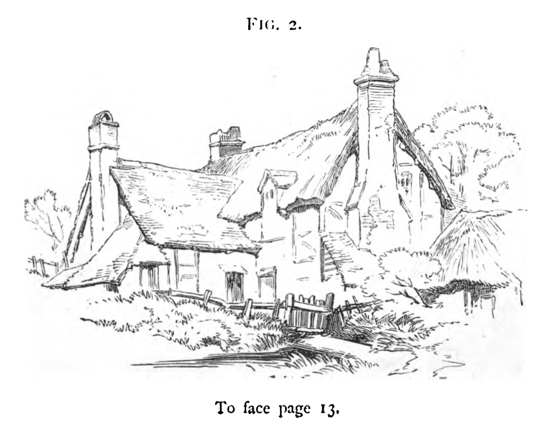
Select the most interesting part of the scene and perhaps omit the uninteresting bits. Generally it's subjective, so it's your call on what to include and what to omit. (The author admits that they're hoping the comparison between the two figures will tell more than they can in words, so I'll follow that example.). In figure 1 we are presented with a general scene. There are trees, fields, a cottage, and a sense of distance. In Figure 2, the cottage is drawn and only its immediate surroundings are drawn. Figure two is simplified by the removal of the context but is no less picturesque, as the cottage is the focus of either figure.
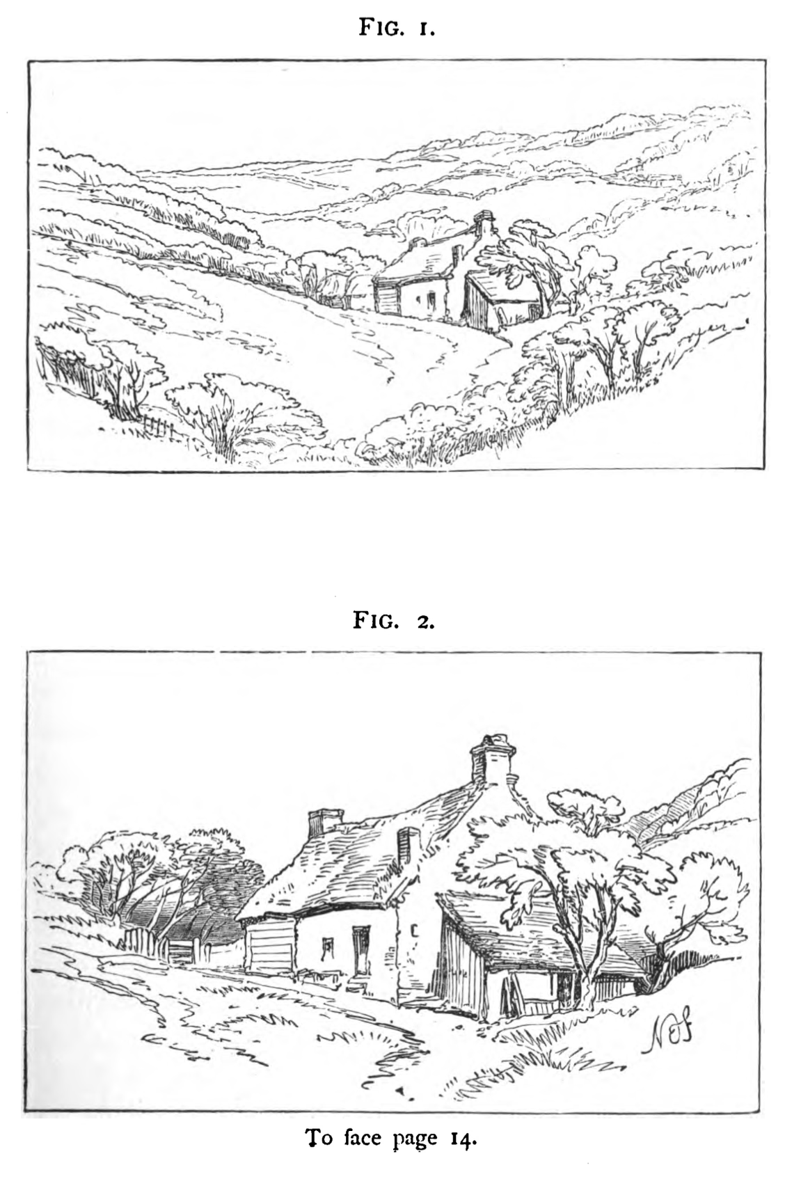
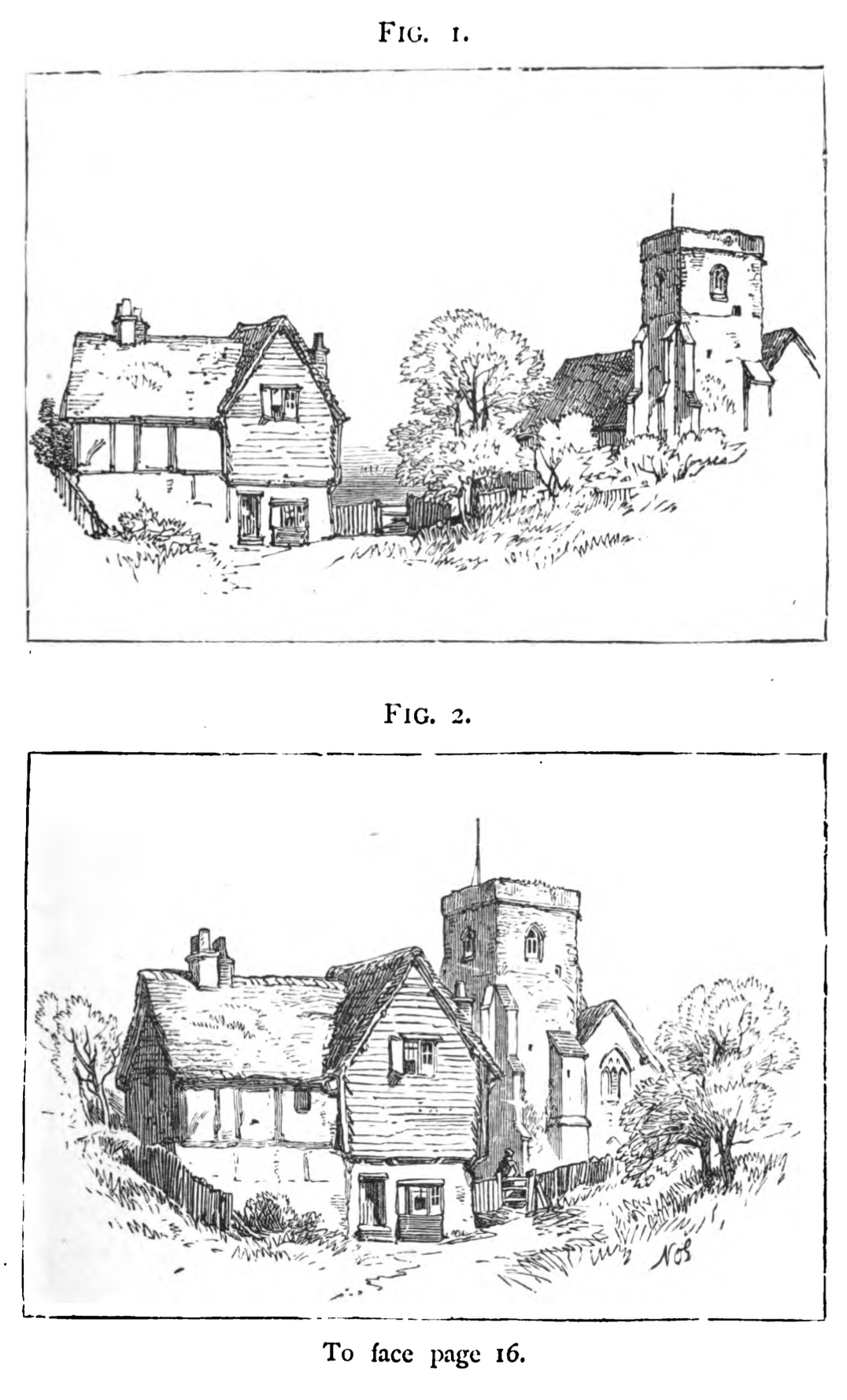
When you have found your interesting scene, you should try to secure the most interesting view of it. Walk to the left and to the right, noting the changes of position. As before, this is a matter of taste or acquired judgement. (So, the author hopes that the comparison between these two figures will help convey that which they did not discuss in words.) Here there is a hurch, a tree, and a cottage. Although both figures show the same objects, there is artistic value in the way in which they are composed. In Figure 1, the three are treated as separate objects - there is no grouping. In Figure 2, the three are brought together and a contrast is created with the unity of the subject.
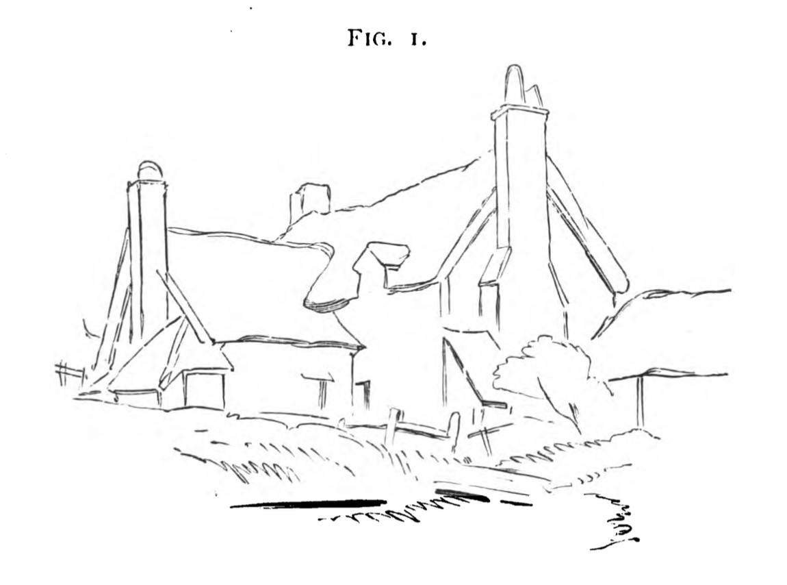
There is an infinite amount of detail in the world, so our aim should be to suggest rather than to realise. Still, our intention is to produce a truthful effect. We will take an example of a cottage. (This author uses the word indicate to represent that which should be implied or suggested rather than drawn to perfection.)
For the chimney, a few strokes for the shade under the projecting courses of bricks or stones with indications of their size and shape is all that is necessary. Any appearance of age or wear, though, should be given great attention; Cracks or patches carefully imitated. For the roof, the tiles of the most expressive age or shape should be drawn first, as well as those near the edges, while those in the middle should be indicated rather than made out. Any moss or grass on the roof, however, should be dutifully placed as it distracts the mind from the monotony of repeated forms. For walls, draw the largest or most clearly marked details, like stones or bricks which form the upper edges or corners, and finish by indicating the smaller or less defined shapes. Continue this trend for the windows and doors, copying down the most important parts and indicating the rest.
Trees or grassy banks are incredibly difficult to sketch. Try to identify the most characteristic first, then gradually add the less interesting details.
For the beginner, stop whenever you begin to be confused by the shapes you have drawn and move on to the next feature.
Remember that the edges of every object is the most important to stress - this includes the parts which come into contact with other objects or those which shade it, as those points will have the characteristic markings most clearly seen.
As an example to demonstrate this, consider a tree against the sky. Here, the forms of its groups of leaves are most evident, or when a bough is thrown out in contrast with a deep tone of shade. Similarly, the form of grasses are most brought out at the edge of a pathway, of against a shade - particularly the deep tones under hedges or trees. Once this careful outline has been drawn, filling the rest of the shape should consist of much slighter and more delicate indications.
Feel free to rough out the locations or arrangements of things with charcoal. It can be easily dusted away until you find the desired arrangement.
Generally, the most interesting sketches have the subject on the bottom half of the paper, leaving room for sky above rather than ground below. But that is not a hard rule, as the circumstances of any sketch are different. The only rule which should be generally followed is to never place the subject of interest in the exact center of the paper. This applies especially to towers, trees, spires, the horizon, the sea, or any long landscape or building. The rationale here is that the center divides the surface into two equal parts, and thus produces uniformity rather than variety. (Where variety is the effect desired.) To get a feel for this, consider the following sketch.
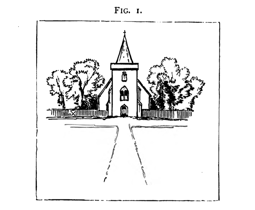
Here, uniformity is carried to a ridiculous extent. The spire is at the center, the pathway leads directly toward it, and the shape of the sketch itself is a square. This can be corrected.
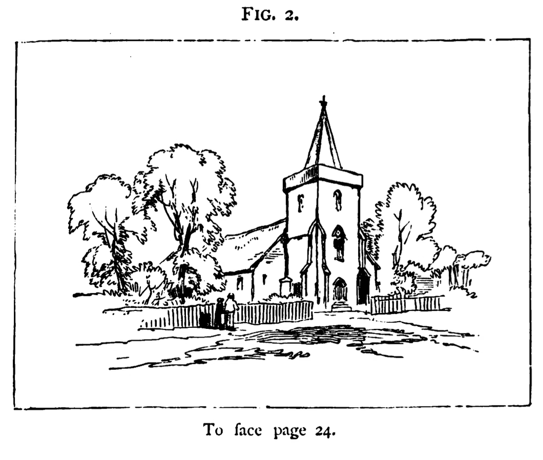
Here, we have stepped a few feet to the left and gained a better viewpoint of the subject.
On another note, try to avoid picking structures in which the windows and doors create the illusion of a face on the wall.
Vignettes give the suggestion of unrestricted space and unboundedness. This is driven by avoiding attracting the eye to the edges or corners of the picture. The best way to eliminate this is to break up or remove long straight lines. Take for example, the following sketch.
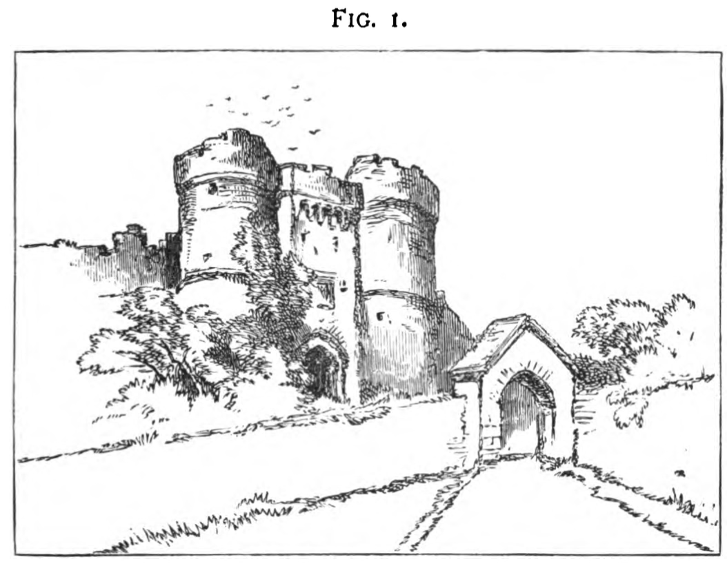
The castle walls as well as the pathway draw the eye away from the castle and to the bottom or left. We can resolve this by discontinuing the lines before they reach the edge, as well as to break up the lines with something.
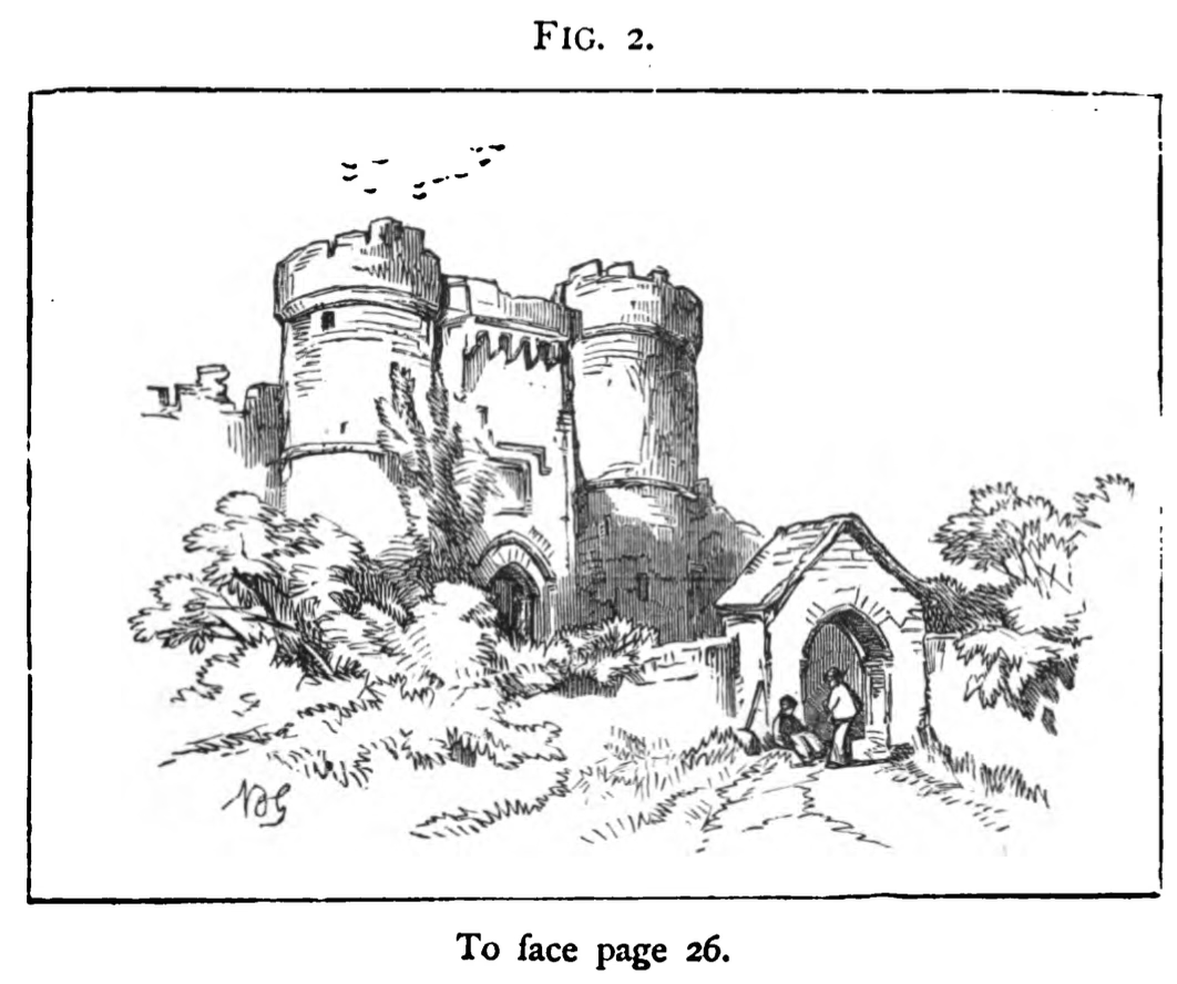
The selection made in the redo of the sketch shows the use of ivy and leaves to break up the lines, followed by cutting them short before they reach the edge. Cracks and tufts of grass were added to break up the pathway, and people were added to the gate - this additional feature further distracts the eye from the leading lines of the walls and keeps the eye near the focal point.
[Todo: Chapters IX - XIII]